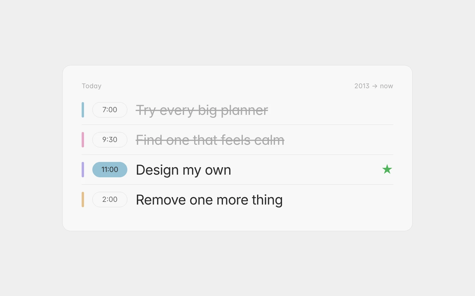
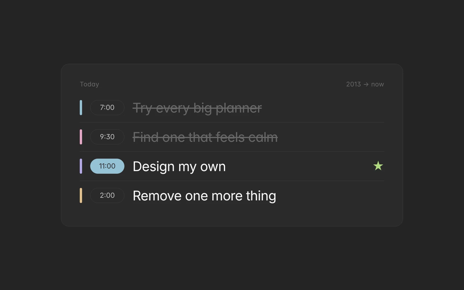
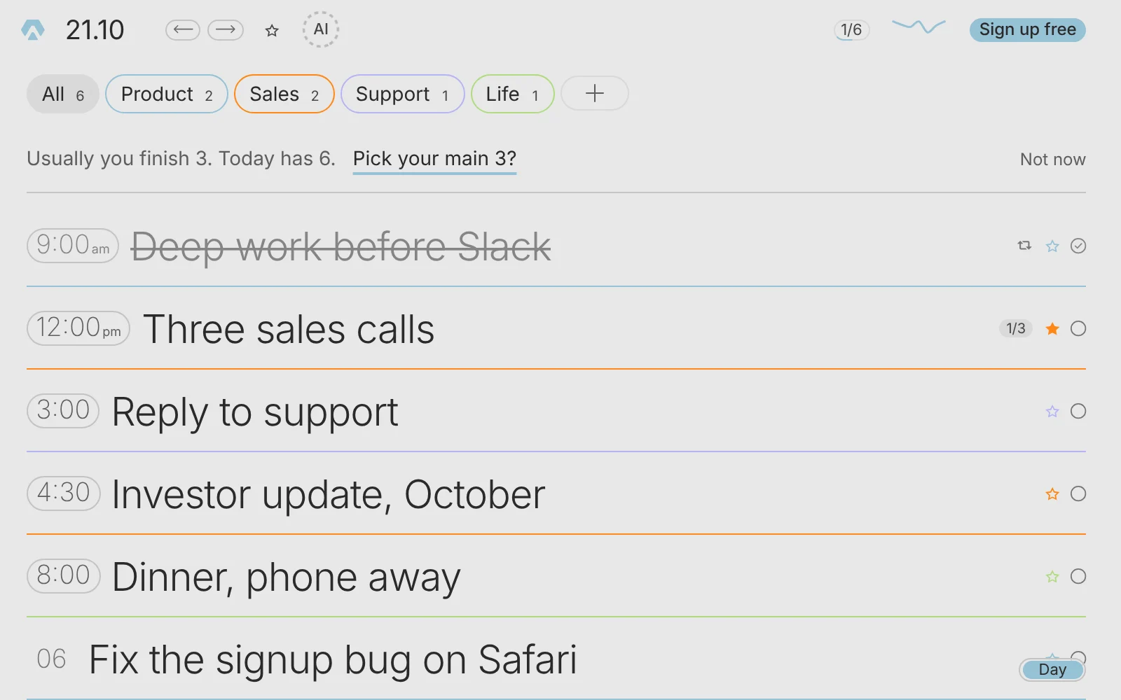
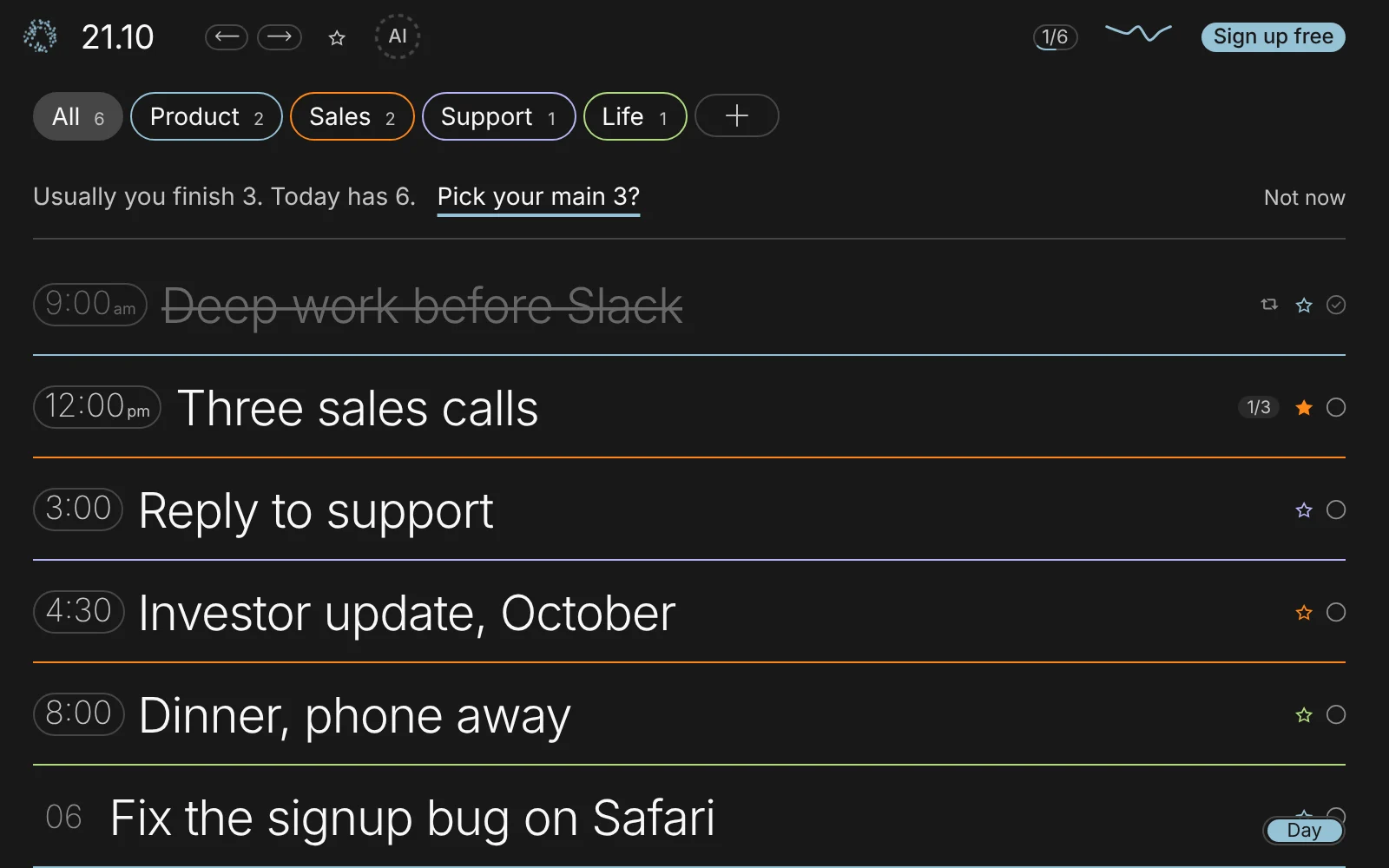
In Aimgod: The day view, live now
Aimgod vs a Popular Task Manager: A To Do List App Alternative
A to do list app alternative built on less: one day, three screens, a typical task manager next to Aimgod. The day, the subtasks, the week.
 By Oleksandr Sendziuk · 6 min readFollow on LinkedIn ↗
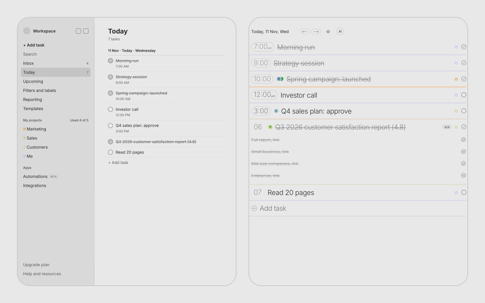
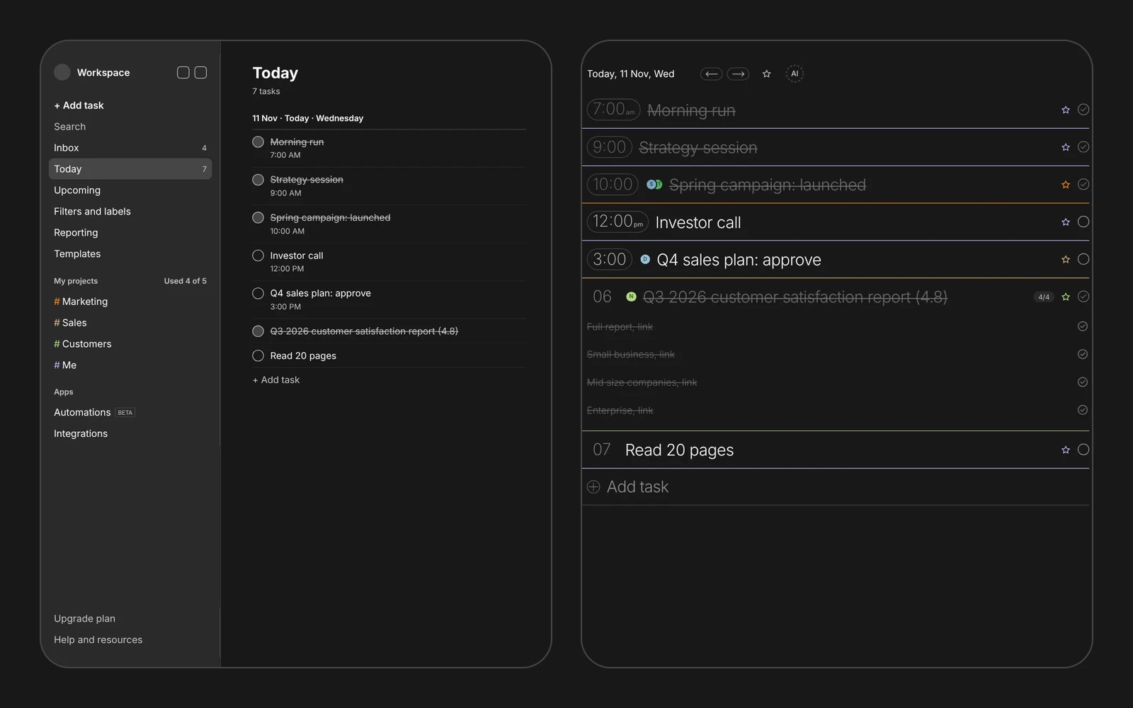
Most task managers grow the same way. A menu, then a toolbar, then filters, reports, templates, automations. Each one is reasonable. Together they bury the only thing you came for: your day. A to do list app alternative has to go the other way.
Aimgod is a step toward minimalism, and that is the whole difference. Below is one day, a CEO's Wednesday, on the same 1440 px laptop screen, three times over. The typical screens are my own drawings of the pattern, no brand, no screenshot of anyone's product. The Aimgod screens are real.

1. The day
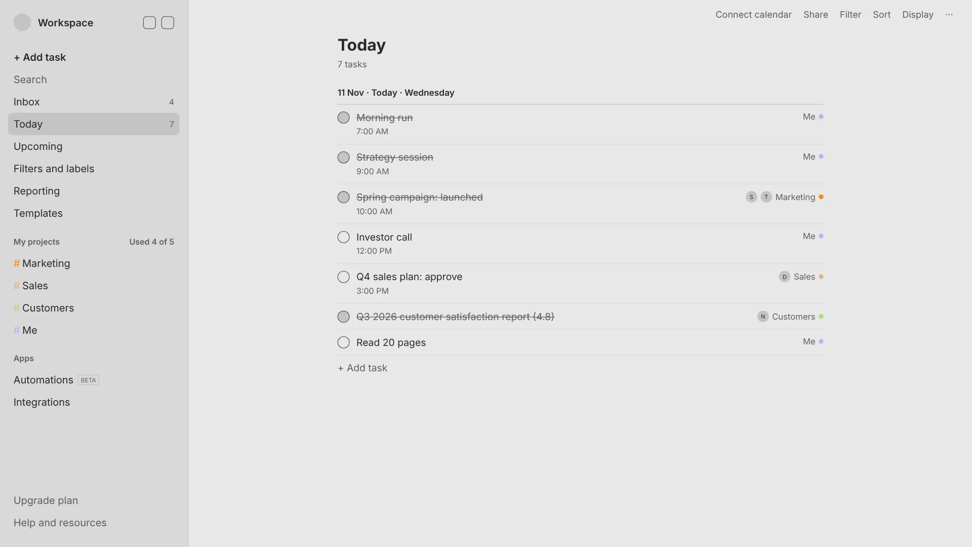
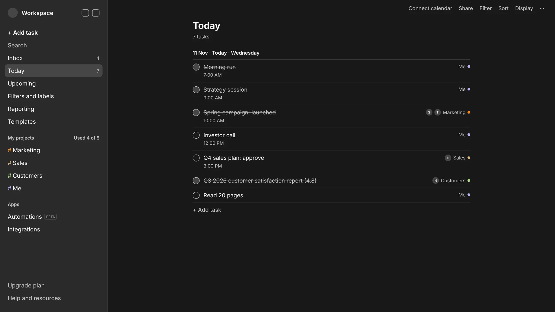
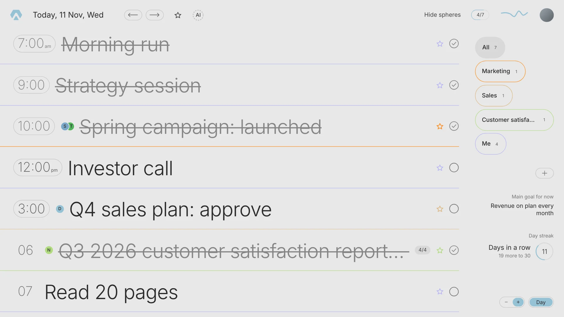
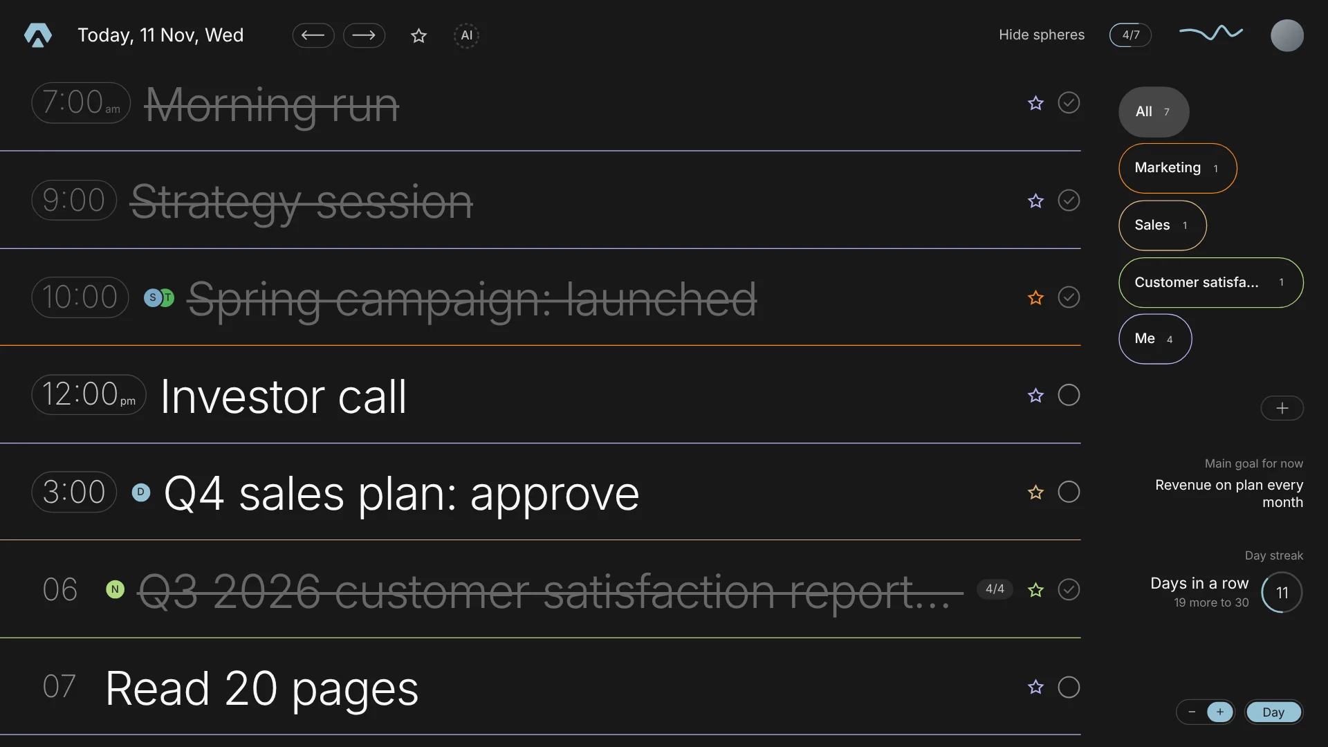
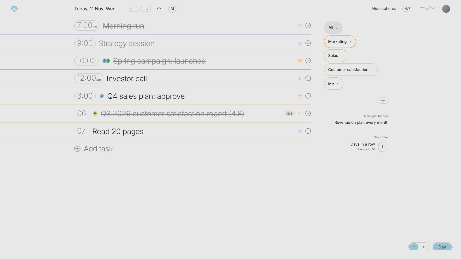
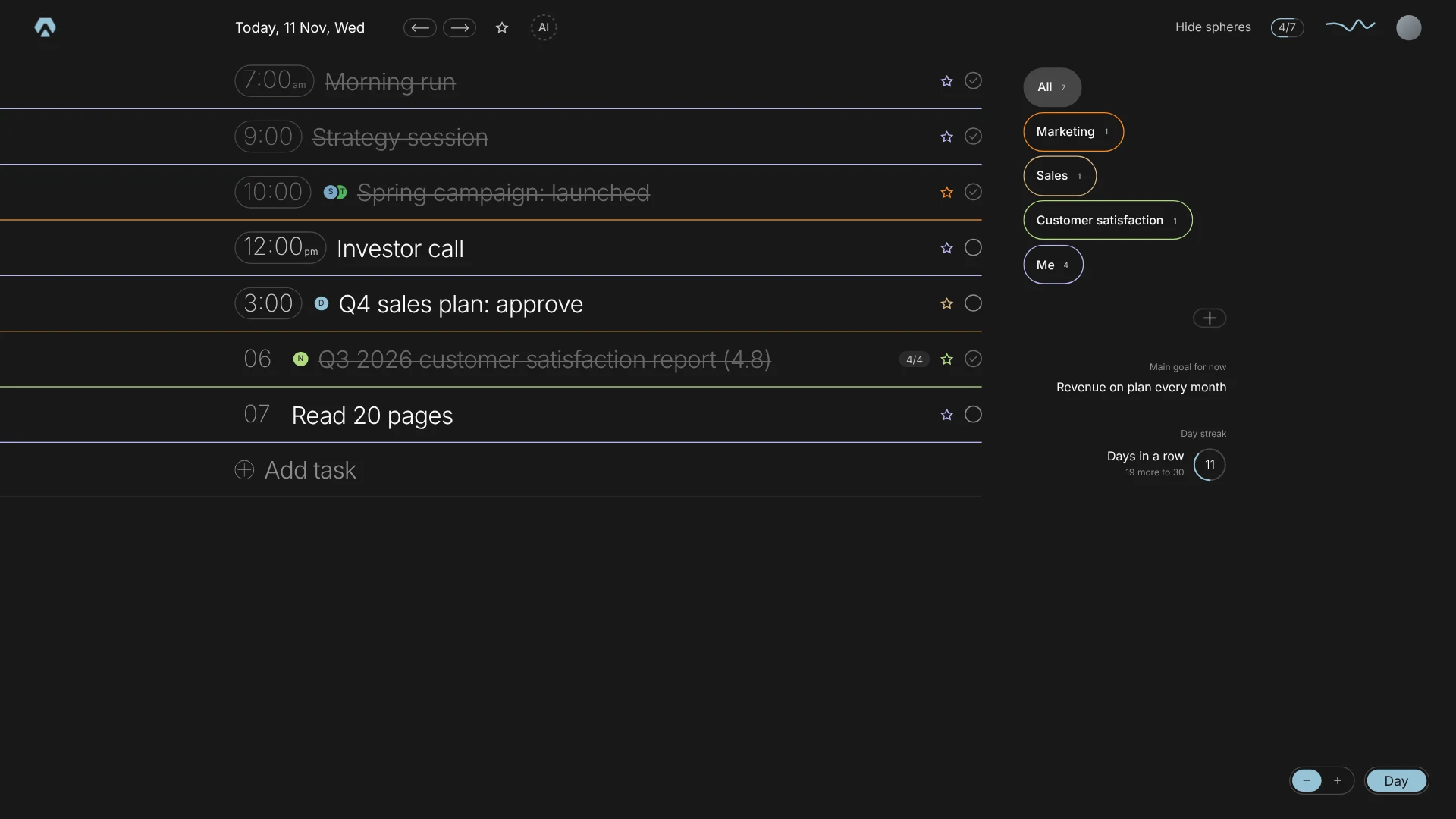
Count what the first screen shows before it shows the day. Inbox, Filters and labels, Reporting, Templates, Automations, Upgrade. None of it is about Wednesday. The day sits in the middle, in the smallest type on the page.
Aimgod has two sizes for the day and no menu around it. The regular one sets a task in 24 px. The large one in 51 px, readable from across the room, the way you read a departures board.
The large view is not for people with bad eyes. It is for people who want to focus. Seven lines is about what a head holds, and a screen that takes seven lines asks you a useful question: which seven. The answer is the spheres on the right. A sphere is an area of your life, like Marketing, Sales or Me. Tap one and the day shrinks to two or three tasks. Nobody has twenty five tasks in one sphere on one day. If you do, most of them are steps of one task, and that is the next screen.
The regular view is for days you do not want to sort. Thirteen tasks on the first screen, still nearly twice the type of the typical one, because the time sits in front of the title instead of on a second grey line under it.
1.8 billion
people worldwide had presbyopia in 2015, the age related loss of focus up close
2. The subtasks
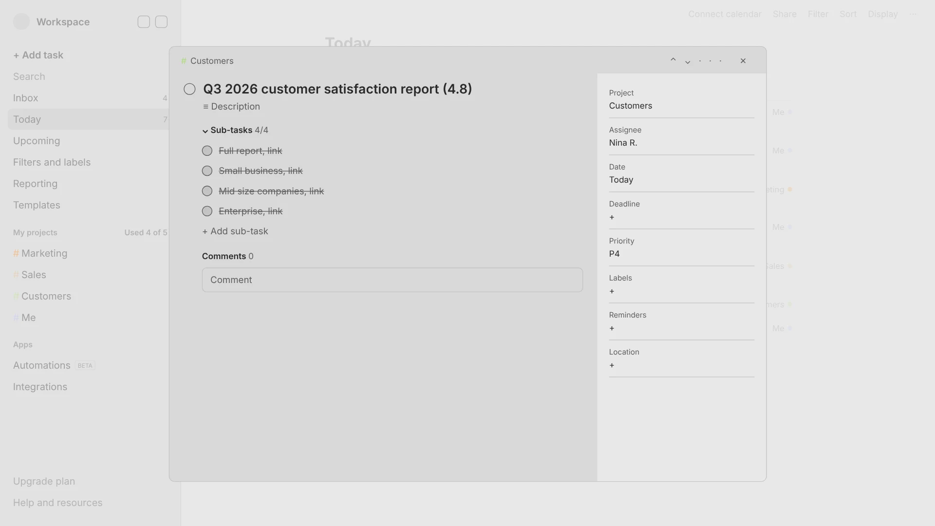
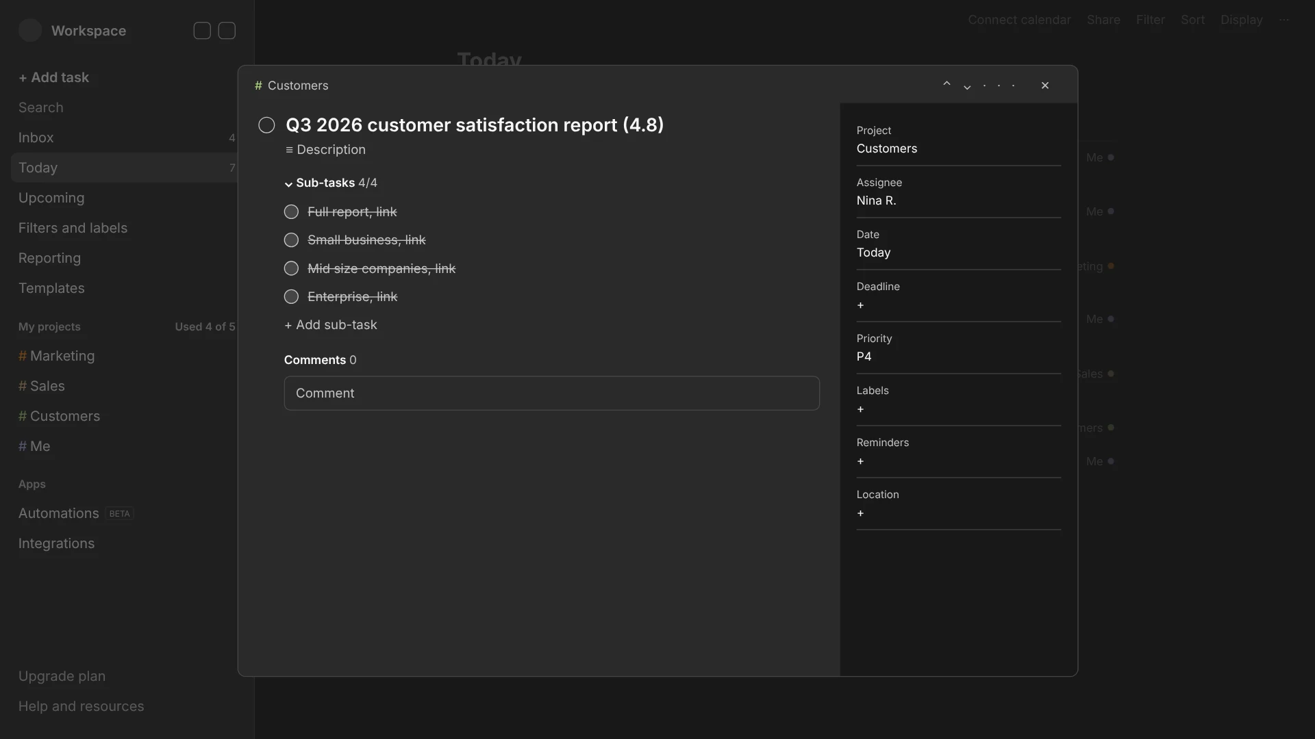
In the typical app you click a task and a window covers your day. Inside it: Project, Assignee, Date, Deadline, Priority, Labels, Reminders, Location, a comment box, and somewhere among them your four steps. To tick one you open the window. To see the rest of the day you close it.
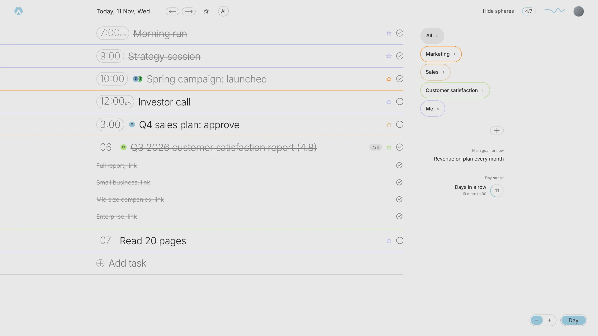
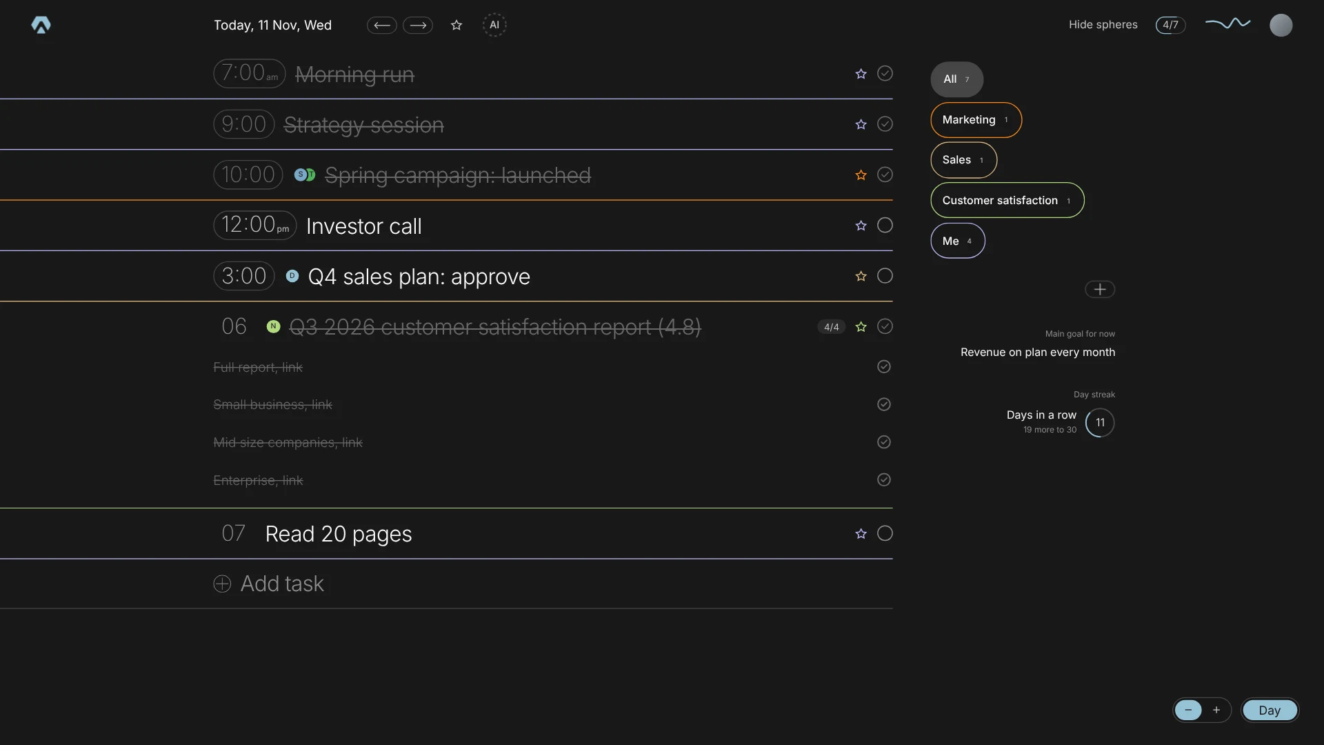
In Aimgod the steps open right under the task. The day stays where it was. One task can carry a whole working day, "Ship the landing" with ten steps under it, and the list above and below does not move. This is how a day of forty small things becomes a day of five real ones.
3. The week
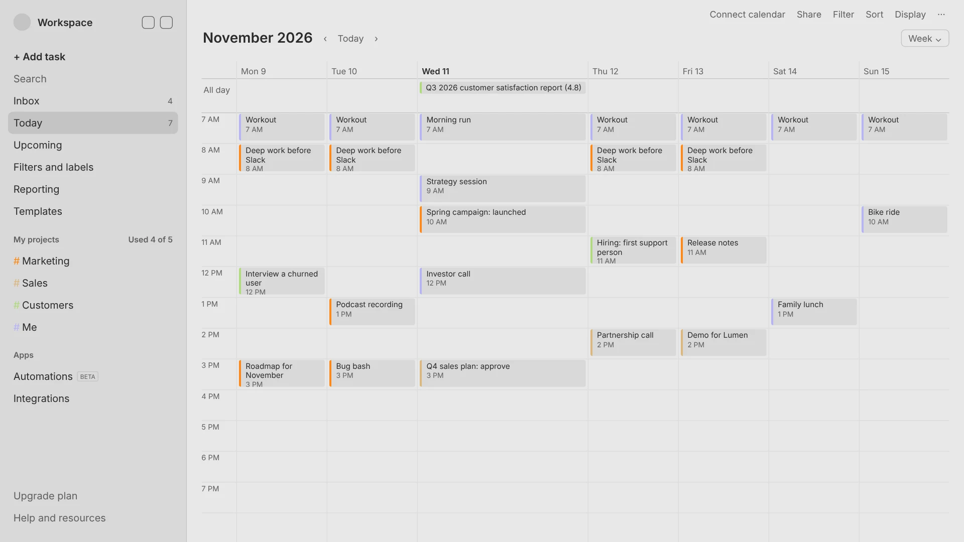
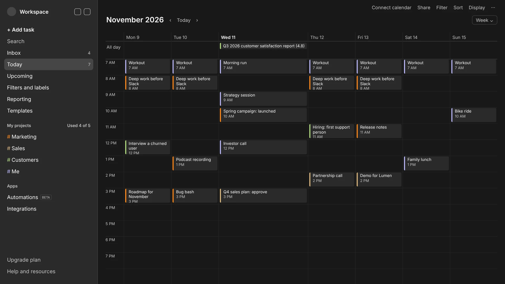
Most apps have a week. It is almost always the same one: a table of hours. Thirteen rows by seven columns, ninety one cells, twenty five of them holding something. You scan a spreadsheet to learn that Thursday is light.
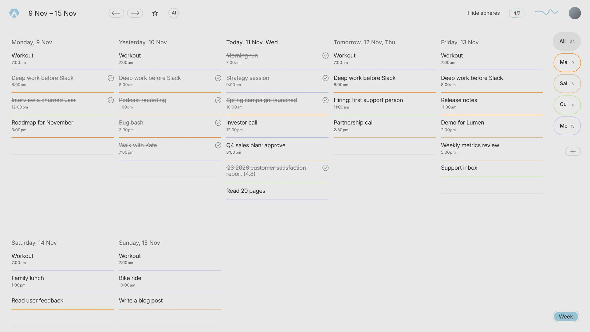
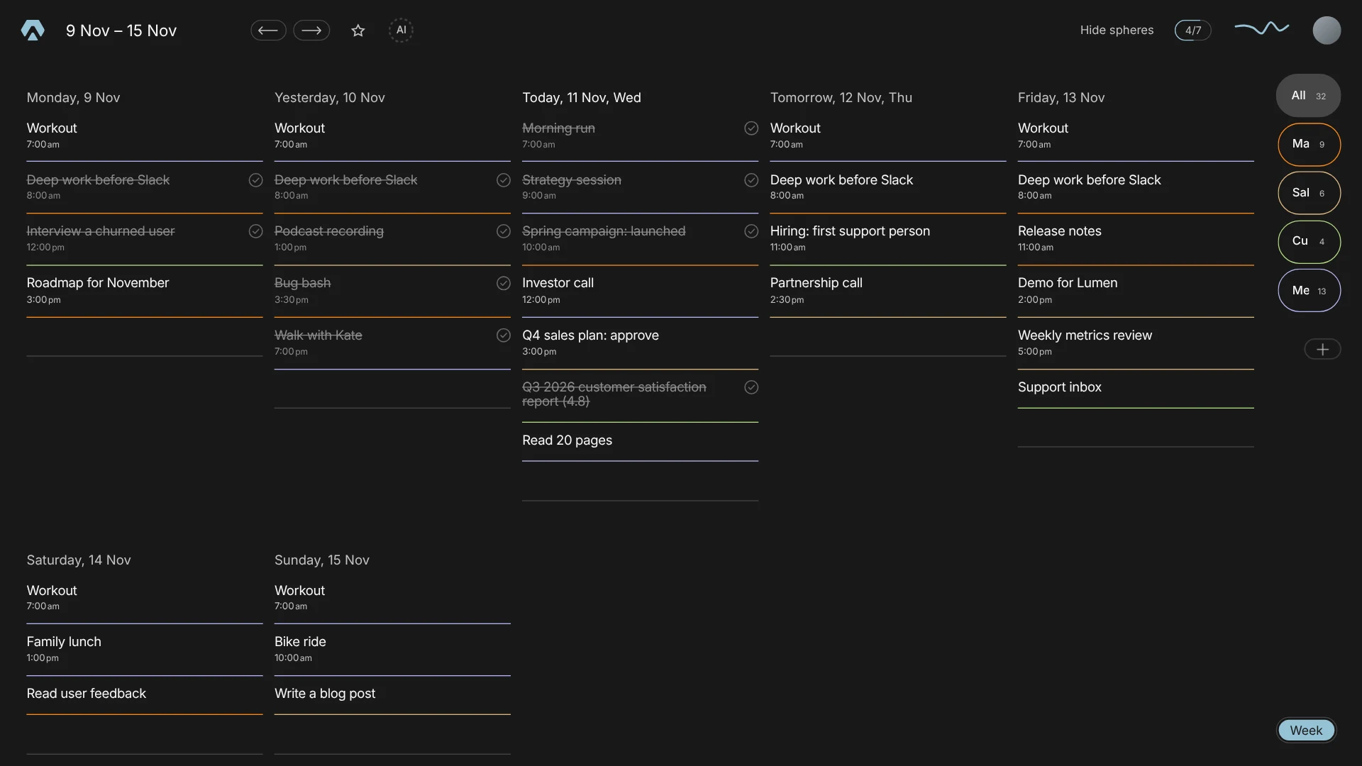
Aimgod's week is seven short lists. Each task is a line with its sphere's colour under it, done tasks are struck through, and the spheres on the right filter the whole week with one tap. Press W on a laptop to open it. A heavy week fits too: five days side by side, about a dozen tasks in each, around sixty on one screen. It reads like a planner, not like a table.
4. Who it was built for
Aimgod started as a tool for a freelancer: one person, three or four real tasks a day, each one hard. That is why the type is large and the screen is quiet.
It turned out that the top of a company lives the same way. A CEO does not need twenty five tasks on a screen. Look at the day above: a run, a strategy session, an investor call, twenty pages of a book, and three lines of work, each one the main task of a director, with that director's face next to it. He taps Sales and sees one line. The rest is delegated, and the people it is delegated to have their own quiet days. The whole chain is in how to manage a large team.
It works the same for big teams. Each team is a sphere: its tasks land in the day of everyone in it, the people in charge sit on the row, and the steps live inside the task. Here is an operations director with five teams in one week.
So the honest answer to task manager vs day planner is not about team size. A task manager shows you everything and lets you filter it down. Aimgod shows each person their own day and lets them share a sphere with the people who need it. More delegation, fewer screens. If your work needs boards, permissions per column and a backlog of four hundred tickets, that is a different tool. If it needs each person to finish the day they planned, it is this one.
5. A time in two taps
One more, because I do it forty times a week. In the typical app, setting a time is a small quest: open the task, find the date field, a popup, scroll to the time, tap, confirm. In Aimgod you tap the number on the task, a time wheel opens in the row, you slide and let go. More in how to plan your day.
6. A to do list app alternative, or a different idea
Both, I think. As a goal planner app Aimgod also keeps the bigger picture: Aimgod Goals for the month, quarter and year, Aimgod Focus for the few thoughts you keep in front of you. But the idea under all of it is one: take things off the screen until only the day is left. I wrote about the beginning in why I built Aimgod, and about the quiet side in a calm task manager.
FAQ
What is a good to do list app alternative?
A day planner that shows your day in time order, in large type, with nothing on screen that is not about today. If you want fewer screens rather than more features, it fits better than a classic task manager.
Task manager vs day planner: can a team use a day planner?
Yes. In Aimgod each person has their own day, and a shared sphere puts the same task in everyone's list with the faces of the people in charge. A manager sees only the main tasks of the people who report to them.
How many tasks fit on one screen in Aimgod?
On a 1440 px laptop: seven in the large view at 51 px, thirteen in the regular view at 24 px, about sixty in the week view across five days.
What is the best planner app for focus?
The best planner app is the one you open every day without friction. For me that means a time in two taps, type I can read at a glance and a colour for every part of my life.
Terms used in this guide: Daily planning, Day, Time ruler, Subtask, Goal, Monthly goal, Focus, Sphere, Shared sphere
Aimgod in three facts
- Free
- on the web and on iPhone, in the App Store since October 2026
- Web + iPhone
- the same day on both, changes land in seconds
- Claude
- a free connector: plan and review your day by voice